• work
    • MURALS
    • type illustration
    • LOGOS + MARKS
    • ALPHABET
    • ART + ILLUSTRATION
  • Contact

THE GING BEARD DESIGN CO

Muralist + Illustrator

  • work
    • MURALS
    • type illustration
    • LOGOS + MARKS
    • ALPHABET
    • ART + ILLUSTRATION
  • Contact

LETTERING | NICKSGOOD

Since I started using Instagram ( heavily ) about six months ago it has become like social media crack! No lie! Not only is it an amazing visual platform, but the Instagram community is thriving, supportive, and all around kick ass! A few weeks back I was asked to do some rad hand lettering for Nick Snapple, half of the dynamic duo that is COAST 10 Clothing, out of Minneapolis MN. Now I have never met Nick personally, but because of Instagram we were connected through mutual friends and our mutual entrepreneurial work.

Through Instagram I have met so many people in the Minneapolis area and in the next few months will be moving to the area! I am stoked to be making this move, and cant wait to start meeting in person all the awesome creatives in the Minneapolis area. Including this guy! NicksGood!


tags: Design, Lettering, Handmade, Hand lettering
categories: DESIGN, Lettering
Saturday 08.16.14
Posted by Jon King
 

Hand Lettering | Ligature Collective

So I really haven't been lettering for that long. I admit it. I'm just that good... 91% sarcasm, 9% narcissism

The last few weeks have been lettering heaven. I had the pleasure of hosting AIGA Wisconsin's Morning Blend event, where I taught a little bit about my personal lettering process and got to show off all the cool pens I own ( and spend way to much money on ). I also finalized a few letting logos that you will see on the website soon! Finally I have been working on a few lettering pieces for a lettering competition put on by the Ligature Collective. 

Ligature1_Outline2.png
2014-08-01 01.59.03 1.jpg
Ligature1_Detail.png
2014-08-01 01.53.47 1.jpg
Ligature2_sketch.png
Ligature2_inking2.png
Ligature2_Inking1.png
Ligature2_FinalDetail.png
Ligature_Blue.png
Ligature2_FinalDetail2.png
Ligature2_FinalDetail3.png
2014-08-05 09.26.51 3.jpg
2014-08-05 08.53.10 1.jpg

These guys have been a huge inspiration to me since their beginning in January 2014. The last few weeks they've had a competition to add 2 new members to their group, and I wanted to show you my entries! They still haven't announce who won the two spots yet ( crossing my fingers ) but I wanted to show you guys the hard work I put in!

Show me some love by tellimg me what you think of the designs in the comments and giving them love on Instagram!  1 -&- 2

Ligature1Final.jpg
tags: Lettering, Design, Ligature Collective
categories: DESIGN
Thursday 08.07.14
Posted by Jon King
 

"What's In" | My Sketchbook

Now you should understand that I did "groom" this selection. You don't need to see 500+ pages of scribbles. Instead I want to show your the good and kinda ugly from my sketchbooks.
***There are pages that should never see the light of day. Like crazy, just woke up, bed head, Medusa scary. You dont need to see those. ( but if you do need to see them Ex. 1, 2, 3 )

MY PROCESS: Part of my natural creative process tends to be untidy, messy, and unkempt. It is like that for may creatives. Its almost impossible to make print ready designs on the first try like I have tried to make you believe on the blog & Instagram  ( exhibit A, B, C ). It takes hours and pages of my sketchbook to refine my ideas into polished, final designs and drawings. Most of these pages are just scribbles. Like chicken scratch, mixed with a three year old's drawing of his family, and a doctors signature, scribbles. Somehow after much TLC they magically go from scribbles to the final products that I share with you on Facebook, Twitter etc.

In my professional experience every designer is drowning in sketchbooks. Many creatives, including myself, use one sketchbook for the unrefined chicken scratch sketching ( say that three times fast ) and a completely different sketchbook for our polished designs. This keeps my “mind vomit” sketches from mixing with the more refined ideas that I come up with later. It also separate the different stages of my process physically and mentally which can be very helpful when working on different projects for several clients at the same time.

MY SKETCHBOOKS: I have 3 different books featured in this post. I always keep two sketchbooks on me e.g. in my briefcase: a large one + a small one. My current favorite is the Canson Mix Media sketchbook. I personally prefer to work in larger sketchbooks ( 9x12in ) with heavy duty pages that can handle many types of media. The Canson Mixed Media sketchbook is perfect for several reasons:

a >>>  I can fit more sketches on one page which allows me to compare the designs quicker when I revisit them.

b >>>  I use felt pens for almost everything. These pens have a tendency to bleed though thin paper making one side unusable, unless it is specialty marker paper. The Canson Mixed Media has very thick paper for a sketchbook ( 98lb ) which cuts down on the ink bleeding through which means I can use both sides of the page.

c >>>  It's ideal for me to have a sketchbook that can take heavy media like watercolor paint, acrylic paint, and heavy flowing pens/markers. Using this sketchbook means I dont have to drag around even larger artist pads ( 18-24in+ ) with specialty paper; I can just use the Canson Mixed Media.

Canson.png

*** I am not endorsed by Canson ( if only right? ), I just think this product is kick ass.

I typically carry around a small sketchbook with me as well and have my eye on the snarky field note sketchbooks over at Eight Eleven Press. Letterpressed and hilarious. For some laughs check her out on Instagram. Almost died.

As always let me know if you have an idea for a “What’s in” post that you would like me to cover and I would love to hear what treasures & monsters you keep in your sketchbook!


tags: Design, Lettering, What's In, Sketchbook
categories: DESIGN
Monday 06.30.14
Posted by Jon King
 

Secret, Secret, I got a secret! | Logo Design

So today we are going to talk about one of my favorite things... the

Logo_Sleep.png

...and my (current) personal #1 rule when developing logos. Cool right?!

There are more steps to developing a killer logo than I care to count. Each designer has a different process for logo design, but most look similar to the following steps (deep breath): research, moodboards, sketches, brainstorming, more sketching, research again, digital comps, presentation of comps, more brainstorming. etc. ect. blah......... blah.

If you are a designer you know the beat of that drum, but if you are not, know that there is a lot of blood, sweat, tears, and knowledge that goes into making a logo. A lot, a lot.

Somewhere in between all those other steps is where my current super secret, high tech, one of a kind, rule to rule all rules happens! What is this rule you ask?!


- Sleep on it -


So I feel like some of you may be giving me one of those sarcastic slow claps, like the ones after a really awful tap routine. Let me give you a few reasons why "sleeping on it" helps me, you, or the designer you payed to make a great logo for you.

You wont get ahead of yourself.
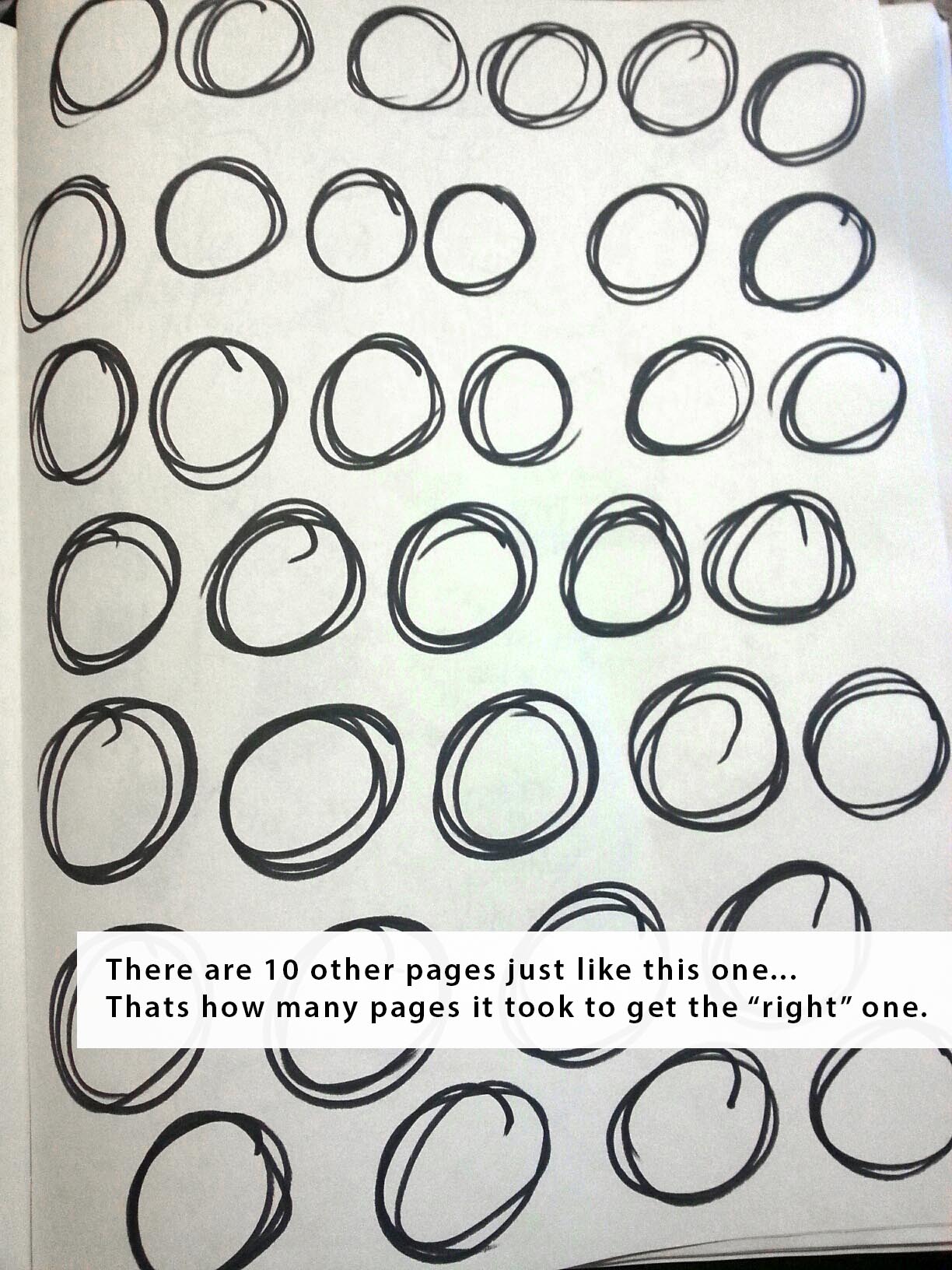
I often get like 4 steps in front of myself when designing a logo. I'll be at the comp stage when I should still be researching or I'll try and finish the logo when I really need to develop some more ideas. By "sleeping on" your designs, you are giving yourself permission to slow down and make smart decisions about your designs.

You have a fresh perspective on your designs
I would love to say that the first ideas that pops into my head for a logo design is genius but typically it's not. Typically they're crap. But if I take the time to sleep on my initial logo concepts I have the ability to come back with fresh/rested eyes and hopefully will be able to easily discern the good ideas from the bad.

New, bigger, better ideas will come to you!
Sometimes the first round of logo ideas can be a uninspired, or just aren't quite there yet. Maybe you haven't spent enough time researching the brand, maybe you didnt have a good day, or your pet hippo ate your ipad etc. Whatever the reason is, this often happens when designing a logo. My suggestion is to sleep on it.  By giving your brain a day or two to process you will be able to brainstorm new concepts that are stronger, and more inspired. Hopefully you will have thought of more creative solutions to your initial concepts as well. The goal is to push them from "meh" designs to "rad" designs.

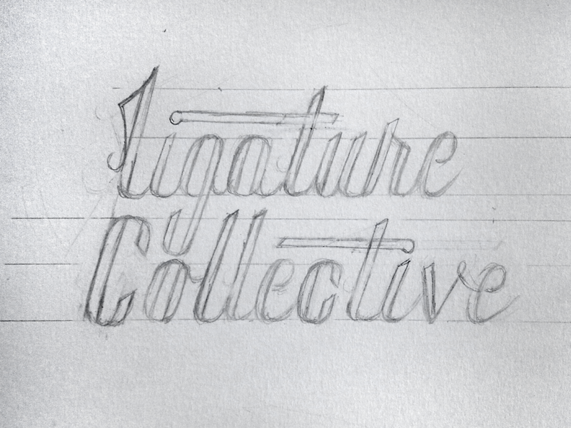
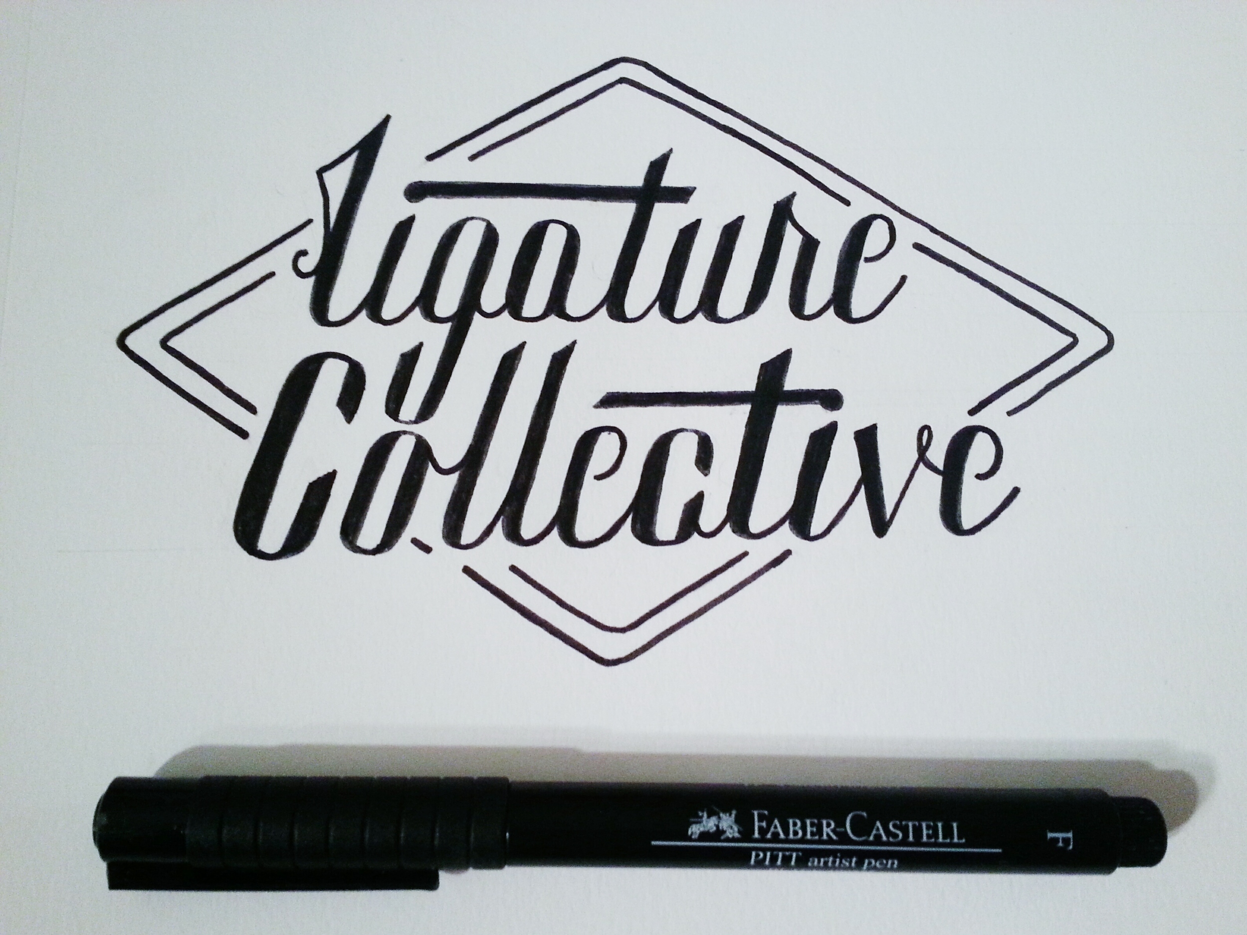
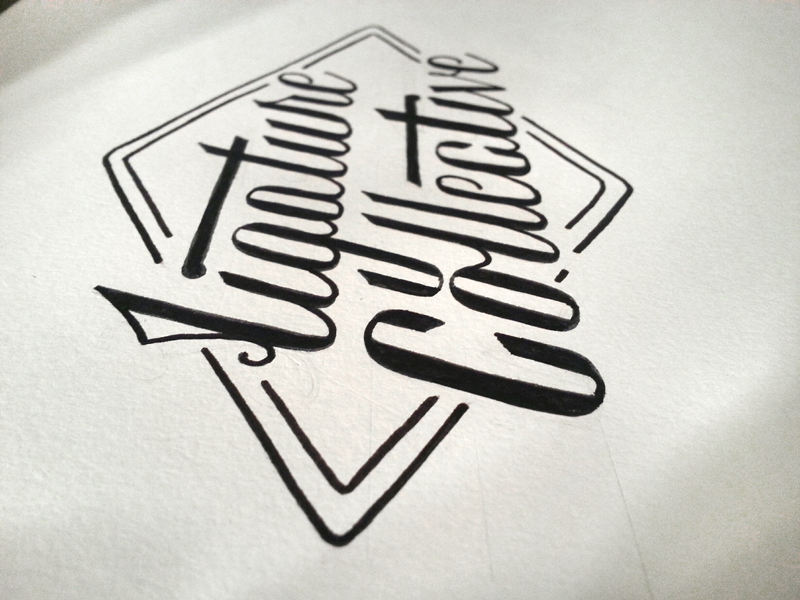
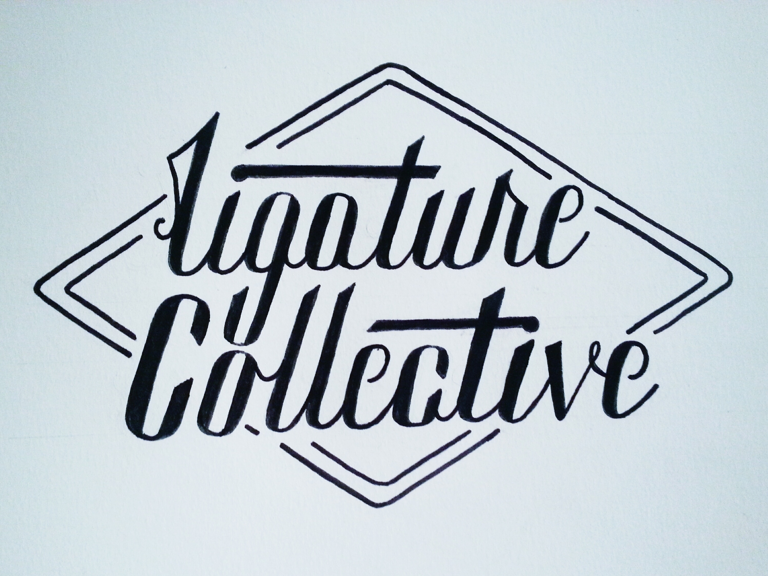
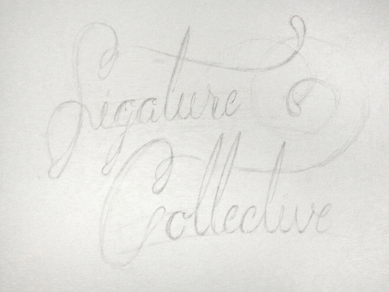
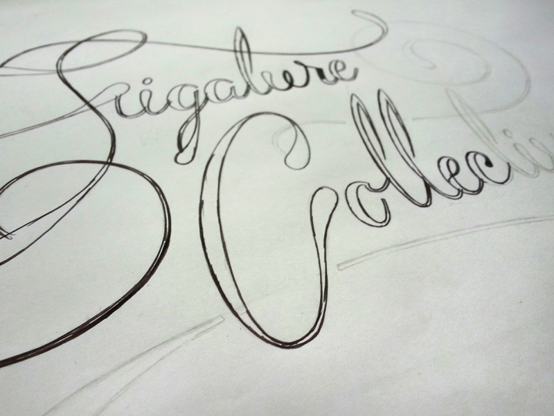
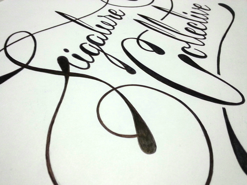
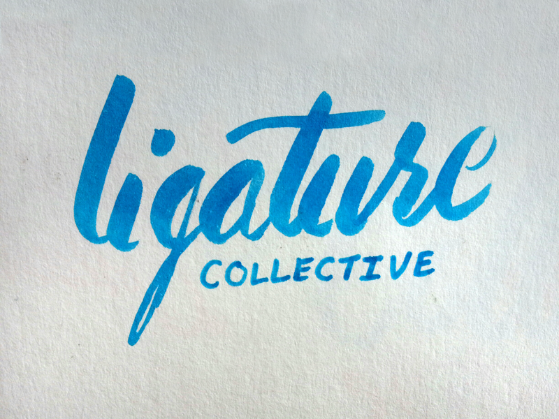
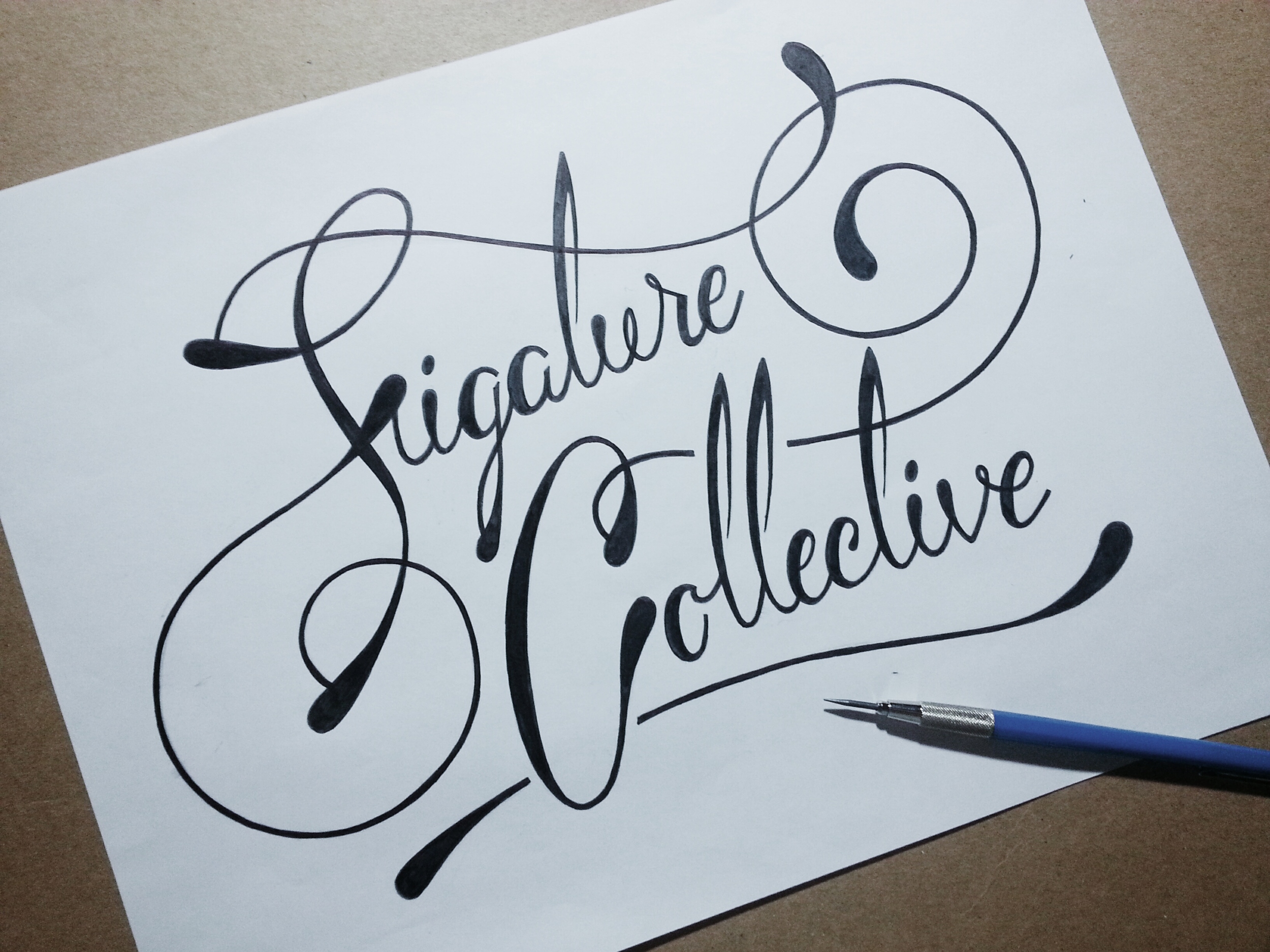
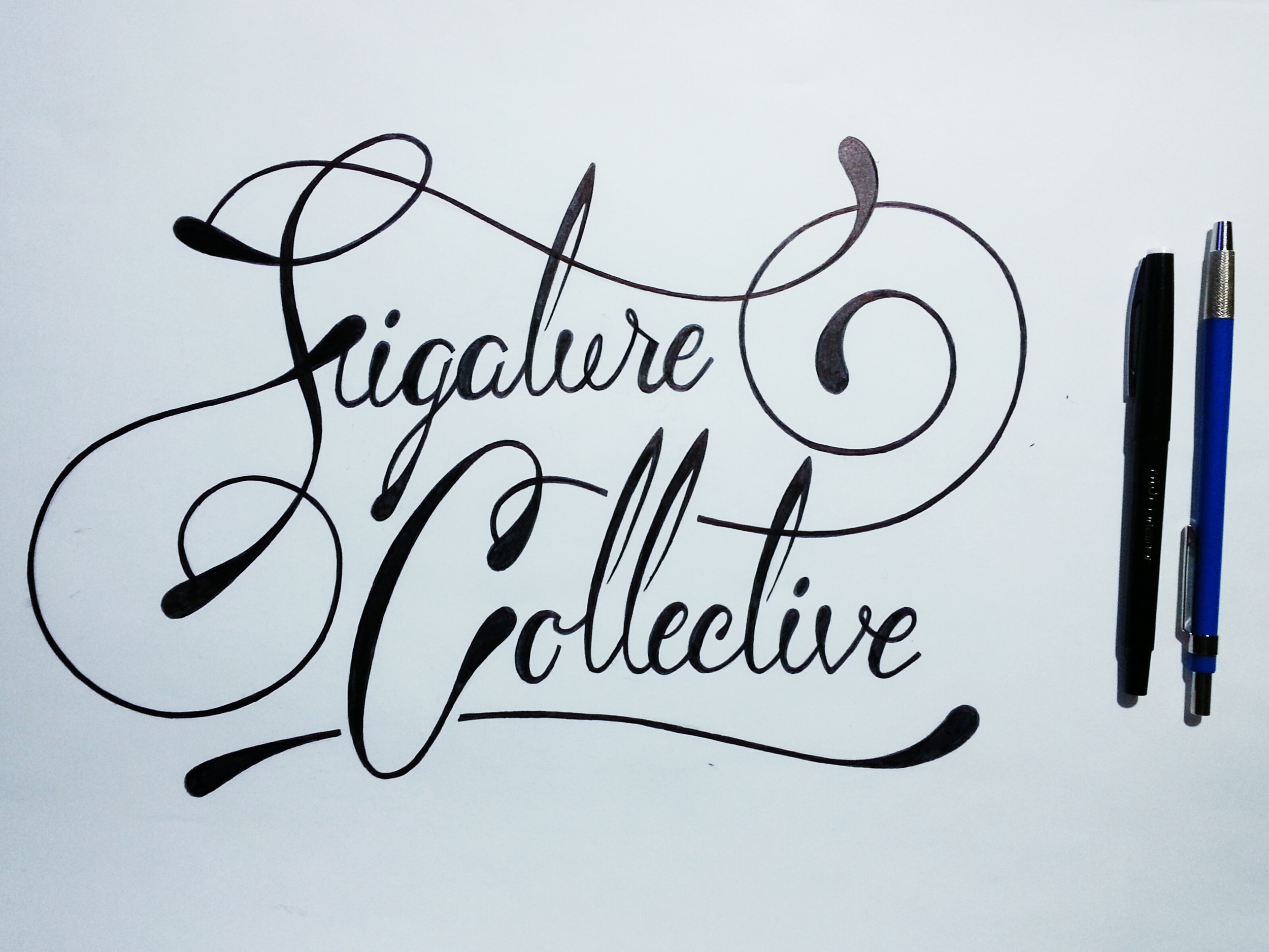
The most common time I need to "sleep on it" is during/after my brainstorming sketch phase. This is a key point in logo design because you need a strong core design concept. Other common times are after I digitize the best logo comps, and when I am doing revisions on the comps. Every logo design is different  but I have learned that if I get sucked into a creative black hole, bounce off an invisible wall or am frustrated with designs that wont come together, it is usually time to step back and give it a night.

I used logos as an example because I know them. They relate to my daily work routine and I understand them,  but maybe you dont make logos. Maybe you make jewelry, or you do business consulting, or own a cupcake factory... ps. I wanna visit a factory that shoots out cupcakes. Or cheesecake! Even better... I digress. Whatever it is you do, there are always decisions that need to be made. Some need to be made right on the spot. You dont have time to think you just act. But there are also decisions/ideas/concepts that we should allow to settle so we can look at them clearly after the dust has cleared. In encourage you to let your ideas breath. Let your creative scope broaden. Dont rush it. Dont worry about it.


Take a nap instead.

tags: Logo, Design, Brand
categories: DESIGN
Tuesday 06.03.14
Posted by Jon King
 

So This Is What I Wore // Get To Know

I recently reconnected with a high school friend, Kathryn Morrison, who has just joined the vast blogging community. She has just started her own fashion blog focusing on woman's wearable fashion. Check it out // here // and get to know her a little better below! Its a fun read!


What was the first thing you did this morning?
I got up and worked out. That was the start of my morning. Jillian Michaels… on mute with my Pandora blasted because I find her annoying sometimes. ;)

Kathryn_BlogPhotos3.png

What do you wish to accomplish?
I want to accomplish being successful in whatever I do. Whether that is fashion someday or having a family. I just want to be great at whatever I set my hand to.

Describe one thing you have learned?
I get to choose how I feel about situations and how I respond to things. There are times when I'm like… “Wait I get to choose how this affects me and how I react.” I can choose to live and move on. Its great! Its empowering. It just hit me the other day.

Kathryn_BlogPhotos.png

When did you realize you were a fashionista?
It started a few years ago and I didn't really realize it till my mom and sister brought it up. People started commenting on things that were just natural to me and what I did. Whether it was my hair or nails of cloths. I realized maybe I did have knack for this kinda of thing.

Who or what inspires your current fashion?
Pinterest is a huge help! I’ve always been a fan of Audry Hepburn, so any time I can keep it classy like her I do. Carrie Bradshaw (aka Sara Jessica Parker from Sex in the City) is a big inspiration as well because she can do crazy fashion but also pulls it together to make it work. And its not cookie cutter fashion. Its unique. Any time I have the mindset of Carrie Bradshaw, someone comments that I look like her and I'm like “NAILED IT!”

What fashion trend are you embarrassed to have been a part of?
Lets see… Ok here is the list: -The feathers and the hair. I spent way to much money on that.
-My mom used to mach all us girls… that was embarrassing.
-I used to have a dress cover in neon fish… awkward.
-Stirrup pants. Nuf said.
-I also used to have a baby blue velour pant suit that was pretty hideous.

Kathryn_BlogPhotos2.png

What is your go-to piece in your closet?
Men's button down lately. I like to try and class it up and make it feminine. All you ladies should try it.

When will we see your line of clothing? Because I know you sew like BAMF!
Ya know I haven't been sewing as much lately. It may be a while. After I get into the whole boutique thing and figure it out… but who knows. All the designing I’ve been doing lately has been wedding dresses. I think if I started a brand now it would be wedding dresses. Actually I would love to conquer the Mother of the bride dress. They are all the same awful dress, with the awful jacket and I hate it! Its horrible.

If your style was a beverage what would it be?
I would say an amaretto sour, because its a little classy and a has a little kick to it!


Check her out!
Blog - So This Is What I Wore
Instagram - @kittykatmeowmor

Kathryn_BlogPhotos4.png

Photography by Nicole Song and Kate Morrison.
Subscribe to my blog at the bottom of the blog page!
Instagram & Twitter family follow me at: @Jonthegingbeard

tags: Fashion, Feature, Design, Modeling, Photography
categories: Features
Wednesday 02.12.14
Posted by Jon King
 

Powered by Squarespace.